PD #30: Big News for Demographics Surveyors!

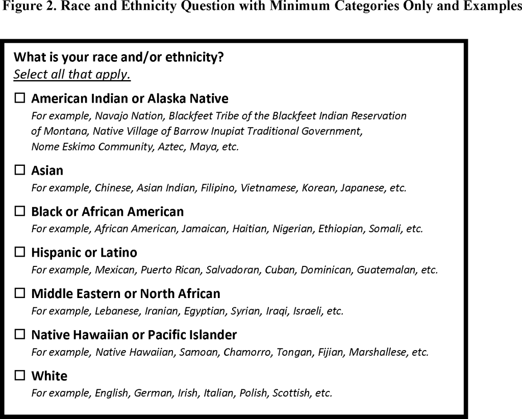
After an 18-month review process, OMB has updated the guidelines for federal collection of race and ethnicity data; you can find a brief announcement here and the full report here for data geeks like me. The bottom line is:

  1. The race and ethnicity questions are being combined into a single question. This is to address the fact that many people who identify their ethnicity as Hispanic or Latino/a/e select either no category or the “some other race” category under the previous version of the race question.
  2. A new “Middle Eastern or North African” (MENA) category has been added. This is to better capture those who identify as being of Arab, Israeli, or North African descent.

These changes are important because, among other things, resources may be allocated based on accurately quantifying groups, so failing to capture group identity is a form of erasure. This guidance will likely continue to evolve. For example, the Afro-Latino Coalition is concerned that combining the race and ethnicity questions “ensures that Latinos are effectively deracinated and may cause Afro-Latinos to be erased.” (Afro-Latino Coalition, 03/28/24). And the Arab American Institute calls the new standards a “major accomplishment,” but also notes their concern that the new category, as implemented, “does not fully capture the diversity of [MENA] groups.” (Washington Post, 03/28/24).

Procedures are in place to continue to re-visit these decisions, but for now, the guidance is summed up in the following table from the full report:
PD #29: Inclusive Language, Continued

Yet another in our ongoing series on inclusive language, as our understanding of the impacts of language is ever evolving. Current best practice is to use the term minoritized instead of minority*, as in the descriptor racially/ethnically minoritized (REM). Intersectionality can be recognized by using descriptors like multiply marginalized.

I like the way this Equity Language Use Statement from the STEM PUSH Network describes the reasons for using this terminology and how it fits with their broader overarching principles of specificity, power & intersectionality, and self-identification. I recently ran across another article that illustrates the importance of specificity: Aggregating Data on AAPI Groups Can Be “A Form of Erasure”

Another consideration is historical context. Here are two resources on why the term stakeholder may be considered offensive, especially by indigenous people, due to its past links to settler colonialism and land seizure: Reflecting On Our Language: Stakeholder and Be Mindful of the Words You Are Using

[*We’ve talked before about the problematic nature of the term underrepresented minority (URM)]

PD #28: A Data Visualization Challenge

GRG is working with the Schwartz Center for Compassionate Healthcare, a longstanding client, to evaluate their new Healing Healthcare Initiative (HHI). The HHI pilot provides education and support to hospitals’ senior leadership teams to reimagine ways to better support healthcare workers’ well-being.

In March, we surveyed team members in several areas that are key to enacting such organizational change. These baseline results will eventually allow us to assess change as a result of participating in HHI, but they can also serve now as a tool for self-reflection and discussion within the teams.

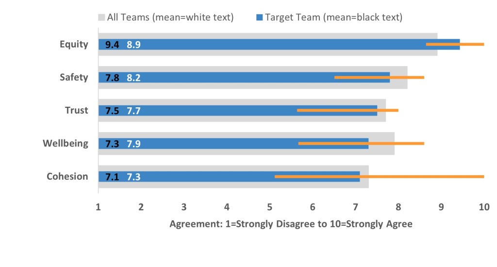
Our challenge was to convey a lot of different kinds of information in a clear and efficient way that would be useful to the teams, showing:

  • The team’s average response in each key area,
  • How their team’s averages compare to those of the HHI cohort as a whole, and
  • To what degree individual perceptions vary within each team.

This figure illustrates (using invented data and simplified key areas) what we came up with. The blue bars show one team’s responses, the gray shaded bars behind show the overall cohort responses, and the orange lines show the range of responses within the one team. What do you think? You can download a template to create this kind of graph here.

Table 1. Mean agreement that strategic decision-making in their organization demonstrates that the organization highly values the principle.

Table 1. Mean agreement that strategic decision-making in their organization demonstrates that the organization highly values the principle.

PD #27: Color Resources & A Timesaver That Will Blow Your Tiny Little Mind

Here together in one place: Three helpful color tools for data viz!

  1. ColorBrewer helps you come up with color schemes that are attractive, but in which the colors are nicely distinguishable from each other. Bonus: You can check if the schemes are colorblind-safe, print-friendly, and photocopiable! Fun to play with: http://www.colorbrewer2.org
  2. Instant Eyedropper is a very useful browser add-on you can install that allows you to copy colors that you see online (e.g., client logo colors): http://instant-eyedropper.com/
  3. And this one may not necessarily be professionally useful, but for color scheme inspiration for all kinds of purposes (decorating, knitting, whatever), I love Design Seeds: https://www.design-seeds.com/

And from Stephanie Evergreen, a timesaver that will blow your tiny little mind (or at least, it blew MY tiny little mind): You can save the Excel charts you create as templates for future use!!

I cannot tell you how much time I spend re-formatting charts for reports. I basically change every single horrible default option that Excel provides (bad colors, chartjunk, tiny/illegible fonts, stupid “Gee Whiz Graph” axis values, etc.), and I have to change these settings repeatedly for the different figures I make.

NO MORE! In the 5 minutes after reading Stephanie Evergreen’s blog post, I’ve already found and template-ified 2 charts I used in the past and like:

PD #26: Meetings, Virtual and Otherwise, Plus a SciComm Reminder

In the way these things always seem to happen, I ran across a cluster of related resources recently.

First, a very comprehensive resource on intentional meeting planning and implementation shared by Meera Rastogi on APA’s Division 2/PsychTeacher listserv: Creating Meaningful Meetings by Kevin Haworth and Meera Rastogi. Be sure to look at the Notes view and not just at the slides; there’s lots of detail there. I was particularly struck by module 9 on group dynamics, but the agenda setting and chair roles were also interesting.

In terms of virtual meetings, here are two more resources from the same listserv: a lit review on Maximizing Virtual Meetings and Conferences: A Review of Best Practices, and a piece focusing more specifically on promoting social connection and networking, Can Virtual Conferences Promote Social Connection?

Finally, just ran across this hilarious and true XKCD cartoon that’s especially relevant for science communication/public engagement with science:

PD #25: Stat Webinar & Twitter Data Viz

It’s been a really eventful week PD-resource-wise!

First, I sat in on a free webinar by Karen Grace-Martin of The Analysis Factor: The Pathway: Steps for Staying Out of the Weeds When Running Any Statistical Model. As a person with a tendency to leap *straight* into the analysis weeds (“OMG, I can test this, and this, and this, and what about this!”), I always find it helpful to be reminded to be more intentional about data analysis. This slide was particularly helpful, and I’m putting it here so I can find it again when needed:

Second, Twitter was chock full of great data viz examples in the past few days! First, from White House Chief of Staff Ron Klain, a graph showing poverty rates over the last 3 years by group. I like how clear they are, and I like the idea of showing the overall average, just in a slightly lighter color.

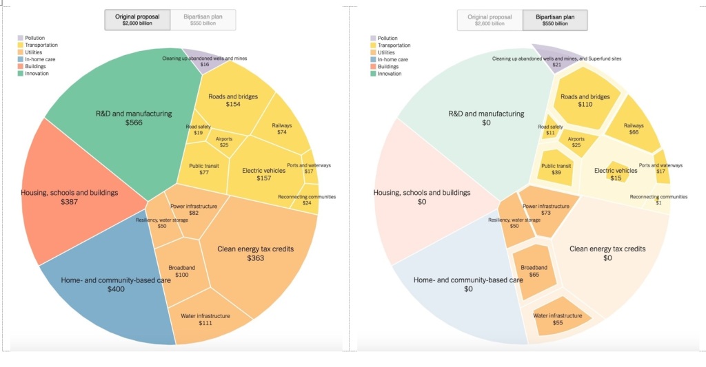
Second, Scott Bixby of the Daily Beast called out the excellence of the NY Times visualization demonstrating the differences between the original and bipartisan versions of the infrastructure bill. I love how it conveys the amounts allocated to each area, and then the comparison between the two versions of the bill.

Finally, I love how Michael Harriot used a data visualization to call out the jerks harassing Simone Biles (even though I had to edit a little):

PD #24: Data Viz & “Difficult” Conversations

I really loved this recent article by Derisa Grant about the presence of identity in supposedly identity-neutral disciplines and framing identity conversations as “difficult” instead of as something that actually should be practiced more. So, so interesting!

Semi-relatedly, I also ran across this very useful post from Stephanie Evergreen about 4 chart types that are especially well suited to displaying inequity.

Finally, I stumbled upon this truly ridiculous, hilarious chart using a form of dumbbell dot plot to show group differences. I like the way the chart title is following best practices in stating the important finding, though I might quibble about the exact wording of it…

PD #23: More! Data Visualization! Resources!

Someone did a Twitter survey of what pie charts are called in different languages, and I find it hilarious that so many of the names involve food. Seriously, a Camembert?

Second, here are some good chart-chooser websites to help decide the best ways to show various types of data and results:

  1. Tableau Chart Chooser
  2. Data to Viz Chart Chooser

For testing the accessibility of your color scheme to people with different forms of color blindness, here’s a good color blindness simulator.

And here are some free data viz tools for things beyond what Excel can easily do, in case you don’t have Tableau:

  1. RAWGraphs
  2. Flourish
  3. Data Wrapper

And finally, for creating Sankey diagrams like the one below from the AAAS Fellowship evaluation, showing fellow employment sector before and after the fellowship, there’s SankeyMATIC

PD #22: DEIA, Broadening Participation, and Language about People

Some really interesting food for thought about the language that’s used about people in DEIA efforts. Taken together, these pieces bring home that language can carry powerful harmful connotations, especially when used to describe people and groups of people. As a first principle, groups have the right to name themselves; second, lumping distinct groups of people under a single name can obscure important differences.

First, some useful definitions of DEIA terminology from the American Alliance for Museums.

Next, an argument that the term “underrepresented minority” should be abolished as racist; further discussion of its harmfulness and the dangers of using “URM status” as a data point is here.

From NPR, audio pieces about whether it’s time to say RIP to the term “POC,” and people’s understanding of the term “Latinx.”